In 2005, a Japanese stockbroker set the company’s share price at one yen for 610,000 shares instead of 610,000 yen for one share. Ultimately, the error cost the company 27 billion yen (or about $236 million). Why am I bringing it up? You can be trained, but numeric sheets are difficult even for professionals. The point is that financial data can get complicated and intimidating very quickly, and the slightest mistake can generate a big loss.
This is especially the case when designing financial applications to be used by John Doe in between household tasks. You need to make sure the data is precise, concise, and easy to apply.
Some time ago, we had the opportunity to improve our client’s application, an online investment platform from the Fintech industry. The most urgent actions were required in the “Funds” section, where users began to keep significant transaction history logs, multiple different assets, and various currencies. The “Funds” section gives the possibility of making withdrawals, deposits, and transactions between investors. In short, this is one of the most often used sections of the entire application.
“Which wallet in my portfolio is the most valuable?”, “How can I compare such a wide number of currencies?”, these were the questions that we heard more and more often. Even the best designs had begun to feel dated and clunky at the time, so we set out on a mission to improve them.
What did we want to improve?
Redesigning the “Funds” dashboard
The first thing we wanted to enhance was the UI/UX of the “Funds” dashboard. This is the first thing an investor sees after entering the “Funds” section. The previous version was hard to read. There were a lot of places where we could make improvements. At first glance, the investor didn’t know in which wallet he had the most money. It’s difficult to convert every currency into dollars in your mind and see the value of each wallet. “We have to change that” – we thought.
We wanted to show the investor clearly, how a specific currency is a part of his portfolio. The best way to show values and data is to use charts. Data visualization provides an accessible way to see and understand trends and patterns in data.
A perfect visualization should specify two aspects of the presented data:
– Show connections in data that are too complex to be explained in words
– Make it easier to understand the information presented and analyze the results from this data.
Instead of a long list of wallets, we decided to serve only the most valuable ones. In place of 2-4 buttons for various actions, we have created one that redirects the user to a page where he can decide what he wants to do. We called it the “Manage page”. Along with these changes, we have also rebuilt the general interface shown below:
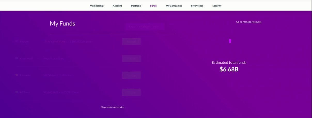
As a result, we created two main columns. One contains the four most valuable wallets with the option to see them all. The second column includes a chart showing (with hover effect) the percentage of a particular wallet for all funds. As you can see, each wallet’s value is converted into USD currency. Users are satisfied with this feature. The entire interface is simplified, and users can focus on what is most important at this point.
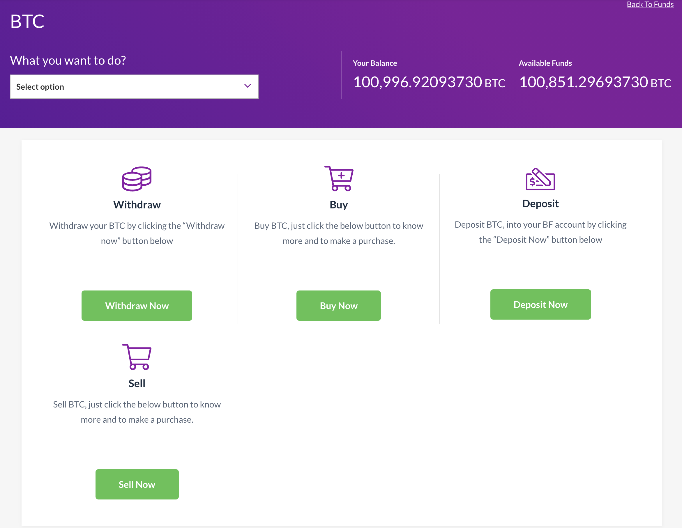
In the new design, after clicking the “Manage” button on a particular wallet, we start displaying actions available for that wallet. Instead of multiple squeeze buttons, we decided to create a “Manage page” where investors can choose what action to take. Every wallet can have different actions. Each action includes a small description with a button. In addition, this page displays all related wallet balances:
Redesigning wallet details view
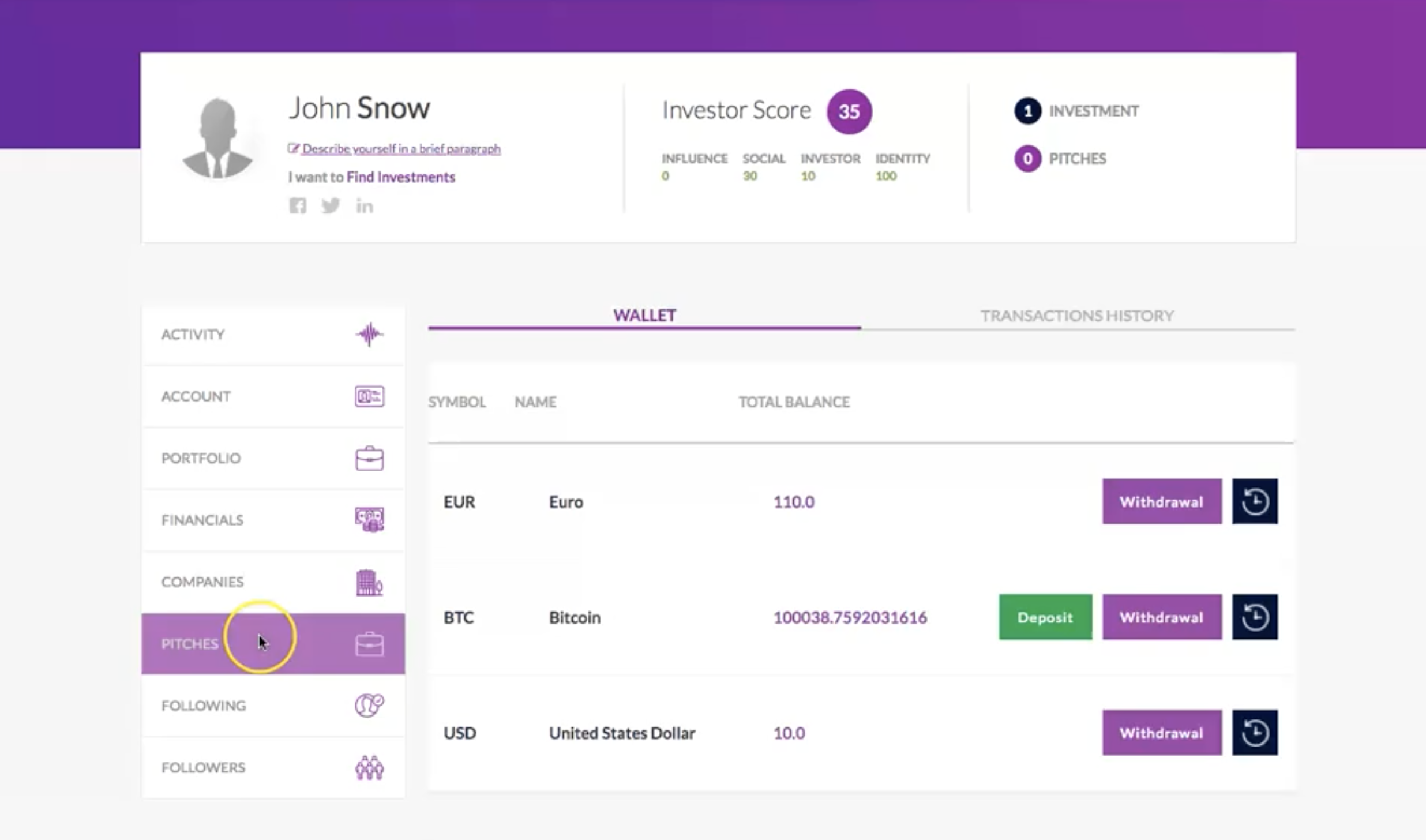
The next thing to improve was the wallet details view. This page displayed the current balance and all the transactions related to the particular wallet. After clicking on the transaction, related details appeared. In the previous version, the details were not obvious. Unfortunately, there were only a few of them. To improve this, we started displaying details more descriptively. Additionally, we had to change the backend logic to improve served data. It was not an easy task.
In the wallet detail view, the user saw related transactions and balances. As you might have noticed, the user also had the option to change the active tab. It was confusing because the first tab showed related transactions. So, what the “Transaction history” tab could offer, you may ask. And it would be a good question. It was divided by backend logic that the user shouldn’t even be aware of.
Rather than just displaying wallet history details, we wanted to allow the user to view the wallet history during certain activities, such as withdrawing money. For example, when withdrawing money, the user should see the history related to the withdrawal only. When making deposits, only the history related to deposits, etc. We haven’t forgotten the main transaction history that includes every type of transaction. We have created such a page, but it is not a part of this article.
To achieve a new flow, we have created a different view with 2 main columns. On the right, users see the related wallet history, and on the left, the form is divided into steps that will guide the user through the withdrawal process. Please take a look to compare:
The old wallet details view
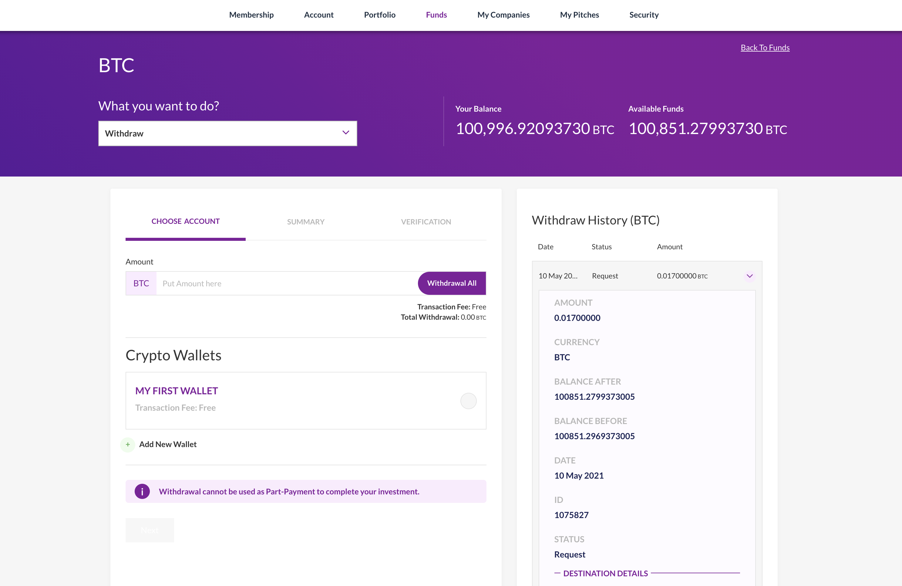
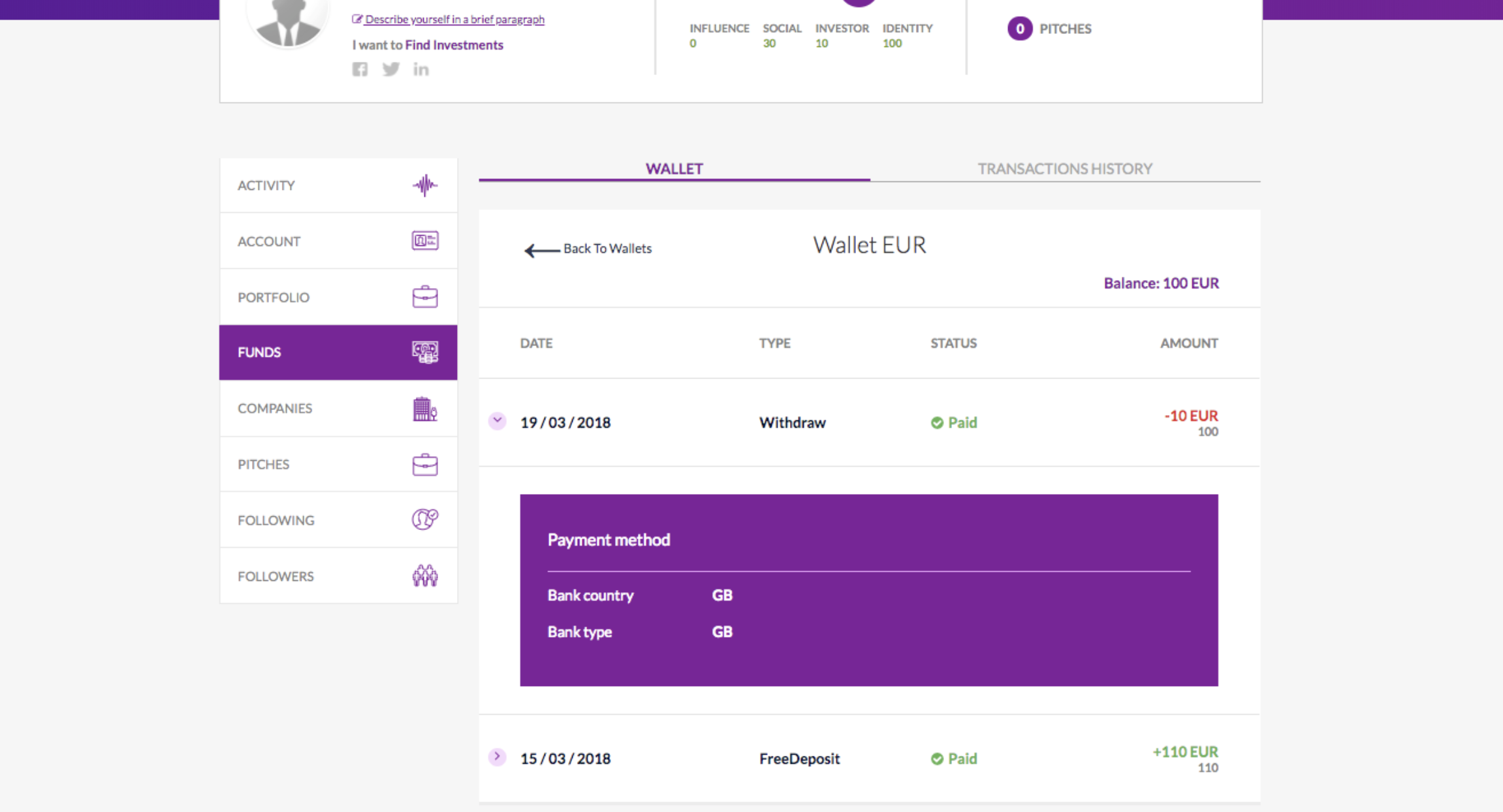
The new wallet details page, purposed for withdrawing
Above, you can see the page whose main purpose is to withdraw money. The withdrawal history on the right is for your reference only.
As you have noticed, at the moment, the history contains many more details about each transaction. Some of them are very useful:
- Balance after
- Balance before
- Wallet address
- Clickable link with the blockchain transaction ID
Let’s focus on the left side of the new page. Dividing the process into steps simplified the complicated logic. For example, at the moment, the user can create and save wallets and bank accounts. Once used, the wallet can be quickly used later. There is a separate page for managing wallets and bank accounts. If a user doesn’t have an account or a wallet, he doesn’t need to go to a separate page; he can create an account or a wallet during the process and immediately withdraw the money.
The user can change the interface depending on the current user’s status. The interface adapts to the user to facilitate the whole process. Overall constants remain unchanged so as not to cause unnecessary chaos in the UX.
The user can change the action from the header, for example, from “Withdraw” to “Deposit”. After such a change, the left form changes, and the history on the right starts displaying history related to deposits.
To be honest, it’s a small part of the “Funds” section. We have made many improvements to the trading process, wallet view, and overall transaction history. In this short article, I just wanted to show you that UI/UX is crucial in fintech apps.
Sometimes, a little effort can make big, useful changes, and a small mistake can lead to disaster (as in the example of the Japanese stockbroker). When planning, you should focus on what will be most useful to the users. For a second, stop being a developer or a consultant. Try to see the problem from the user’s perspective.
During your refactoring process, you may think of:
- serving additional helpful info during the main actions;
- splitting complicated logic into steps;
- creating a “manage page” where the user will choose an action. A simple description of each action may be helpful.

Managing Director
& Co-Founder of Exlabs