Case Studies
The Asset Platform GIS & UX Upgrade Story
Major GIS and UI upgrade with globe view, optimised performance, and enhanced UX—resulting in smoother navigation and better asset insights.

Building reliable grid intelligence requires not just data – but data you can trust, interpret, and scale.
Client
CRU Group
Sector
Renewable Energy
Country
UK
Executive Summary
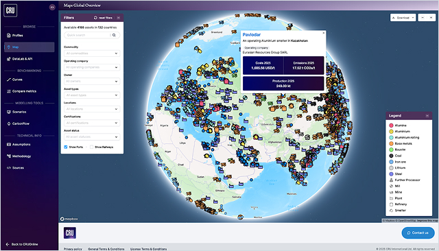
The CRU’s Asset Platform serves as a central information catalogue for over 4,500 mining, metals and fertiliser sites around the globe. This data underpins critical decision-making processes and informs multi-million dollar investments, making its accessibility and usability a strategic priority.
To support stakeholders in quickly identifying and evaluating relevant assets, the platform relies on robust search, sorting, and filtering capabilities, paired with an intuitive and high-performance user interface. However, we identified a significant gap in the platform’s geospatial (GIS) visualisation capabilities. The existing flat map view lacked both performance and usability, thereby limiting users’ ability to efficiently and intuitively explore complex global datasets.
This prompted a comprehensive UX and GIS upgrade aimed at transforming how users interact with asset data on a global scale.
The Challenge
Flat maps slowed insight and usability
We identified growing friction in how users engaged with geospatial data, especially when exploring asset-heavy regions. This led us to propose a shift toward a more modern, intuitive interface, including a transition to a globe-based visualisation.
Our goal was to align the platform’s capabilities with the expectations of industry users who rely on clarity, speed, and responsiveness in navigating global assets.
Central to this was a transition from a flat map to an interactive globe, enhancing both aesthetics and functionality. However, incorporating real-time GIS layers for hundreds of industrial assets introduced severe performance bottlenecks, especially when zooming or toggling visibility.
Early production testing revealed lagging behaviour and an overwhelmed DOM, jeopardising usability. Compounding this, late-stage data deliveries limited testing cycles, and deployment issues further strained delivery timelines.
Most Common Issues When Analysing Rich Data Sets

Visual Overload & Clutter
When visualising dense datasets, especially on maps, too many overlapping elements can obscure key insights and frustrate users.
Without thoughtful UI hierarchy and filtering, users face decision fatigue and overlook meaningful trends.

Performance Bottlenecks
Large-scale geospatial or tabular data can easily slow down platforms, especially if rendered inefficiently in the DOM.
Lag, freezing, and long load times break user trust and stall analysis workflows.

Lack of Contextual Interactivity
Users need to drill down, compare, and link data points with ease. Static or shallow interactions limit exploration and make it harder to connect assets with underlying metrics, leading to missed insights and poor user retention.
The Solution
Canvas rendering made globe views seamless
To meet performance expectations while maintaining the desired interactivity, we executed a technical pivot in the map rendering strategy. Initially, each asset was represented as a DOM element for maximum styling flexibility.
This approach, however, was unsustainable with large datasets. The solution involved migrating to a canvas-based rendering model using Mapbox layers, allowing us to draw multiple icons simultaneously within fewer DOM elements. While this constrained some styling options, it drastically improved rendering speed and zoom fluidity.
Interactive elements such as tooltips and links to individual assets were selectively preserved using hybrid rendering approaches. The number of GIS layers was consolidated, ensuring manageable complexity without sacrificing data integrity.
Additional optimisations addressed deployment bottlenecks, such as port conflicts and inefficient server responses in the Next.js application, which were resolved via containerization strategies and request routing improvements.
The Outcomes
Faster, clearer, and more engaging
The latest release delivered a vastly enhanced user experience, with tangible gains in performance and engagement. The platform now renders high volumes of geospatial data with minimal latency, providing smooth zooming and interaction across global asset views.
Stakeholders benefited from:
- Up to 60% reduction in map lag during navigation
- Improved clarity and aesthetics via globe-based visualisations
- Simplified asset exploration through tooltips and dynamic links
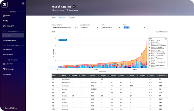
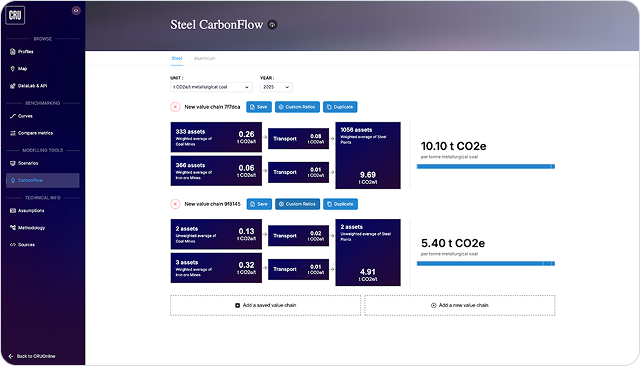
Moreover, the integration of lithium-related economic and emissions datasets further expanded the platform's analytical scope. While comprehensive analytics are still in rollout, early feedback confirms that the UI redesign has improved usability across various stakeholder groups.
Smaller UI/UX enhancements across the platform, such as collapsible panels, cleaner data tables, and harmonised design elements, also contributed to an overall more modern and user-friendly application. Together, these improvements reflect Exlabs' commitment to scalable, high-performance solutions tailored to domain-specific user needs.
Let's discuss your specific challenge and outline a clear path forward.
Mateusz Wilczyński
CTO at Exlabs

Technologies That Power the Platform
With the technical part of the programme delivering ahead of schedule, it was easier for the Local Authorities and Central Government units to focus their efforts on coordinating the other areas of the project, including customer support and onboarding and education of the business customers.
An early release of the vehicle’s Clean Air Zone compliance checker tool allowed the public to understand the upcoming requirements ahead of the full launch, further strengthening the case for a lasting change of driver behaviour and exceeding the very strict standards of the Government Digital Service (GDS).

Mapbox
Vector tiles + WebGL/canvas for high-density rendering at scale

ClickHouse
Sub-second analytical queries for filters/slices without pre-aggregation.

Azure
Blue-green deployments, container hardening, predictable rollbacks.

React / Next.js
Controlled hydration & interactive UIs with predictable performance budgets.

Nest.js
Modular API boundaries for maps, assets, and analytics.
Our Work in Production
Explore how custom software and data platforms are developed to solve complex challenges for leaders in the energy and resources industry.


Frequently Asked Questions
Everything you need to know before you decide to work with us.
We can typically start within 2-3 weeks from our first conversation. The timeline depends on two factors: how quickly we can schedule the technical assessment workshop with your stakeholders (usually 3-5 days after initial contact), and how long the commercial agreement takes to finalize (typically 1-2 weeks).
For urgent situations, we've started projects in as little as one week. However, we never skip the discovery phase—rushing into development without proper scoping leads to costly mistakes and project delays down the line.
Your project team typically consists of 2-4 people depending on scope: a Technical Lead with expertise in data integration and backend systems, a Frontend Developer specialized in dashboards and data visualization, and a Project Manager who coordinates everything. For complex integrations, we may add specialists in specific areas.
Our strength is in building custom software solutions and integrating disparate systems - we learn your domain and technical requirements during the discovery phase, then build exactly what you need. You'll meet your dedicated team during the kickoff, and they'll be your consistent points of contact throughout the project.
We work in 2-week sprints with clear milestones and deliverables. You'll have a 30-minute check-in call every week to review progress, address blockers, and adjust priorities if needed. Between calls, we communicate via Slack or email for quick questions and updates. At the end of each sprint, you'll see working software—not just status reports.
We share access to our project management tool so you can see exactly what we're working on at any time. Most importantly, we involve your team early and often: user testing happens throughout development, not just at the end. This way, there are no surprises when we deliver the final product.
We offer both options depending on project clarity. For well-defined projects (like building a specific dashboard with known data sources), we provide fixed-price quotes—you know the total cost upfront and pay based on milestone delivery, not hours worked.
For more exploratory projects (like "we need to optimize our operations but aren't sure how"), we work time-and-materials with a monthly budget cap—you pay for actual hours but never exceed the agreed maximum without explicit approval.
We're transparent about costs from day one: our proposals include detailed breakdowns of what you're paying for, and we flag any potential scope changes immediately rather than surprising you with invoices later.